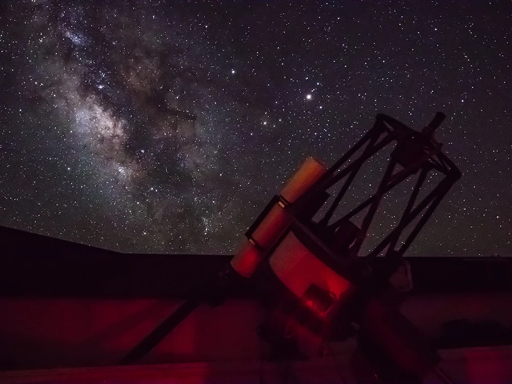
Kitt Peak NationalObservatory
.
Timeline: 1 Week
Roles:
UX Researcher:
Heuristic Analysis
Competitive Analysis
Card Sort
Tree Test
UX Designer:
User Flows
Site Map Redesign
Redesigned Reservation Process
Restructured Site Design
I was recently asked to submit a proposal for site redesign for the Kitt Peak National Observatory. Their visitor center and tours have seen a decline in the past few years and they want to increase visits. KPNO’s visitor center website is outdated and disorganized. The goal for the redesign was to create a site that is well organized and easy for users to find and understand information about the observatory to properly plan their visit. They also wanted to enable users to reserve spots for their various programs online more easily and conveniently, particularly the Nightly Observing Program (NOP), which is their most popular program.
The PROBLEM STATEMENT
KPNOs site is disorganized and users have trouble finding key information and making reservations. How might a redesign help enhance the visitor experience online, increase reservations made online?
Objective
Increase visitors to Kitt Peak National Observatory by making it easier for website users to:
Find information about the observatory (exhibitions, tours, etc.)
Plan a visit
Make reservations for program offerings, especially the popular Nightly Observing Program

RESEARCH + SYNTHESIS

Content Audit
I started with a full content audit of the site to acclimate myself, get a in depth look at the content and determine what could be kept, what could be tossed and where new site paths were needed. The main takeaways from this were the site was incredibly content rich but for visitors it felt more like information overload. There was a lot of useful information but it was not presented in a way users could access or make use of. Below are a few screens of the original site.

Detail Page for the Nightly Observing Program
Too much text to digest or make meaning out of.

Visitor Information Page
Had some good relevant content but was a long page that required a lot of scrolling.


The Reservation Process
These are a few sample screens from the reservation process. Content had not been edited, prioritized, or categorized well. The process had several barriers to entry and left the user frustrated and confused.

HEURISTIC ANALYSIS
In-Depth content evaluation
Competitive Analysis
Once the content audit was complete, I dove straight into a competitive analysis to see what other brands in a similar space were up to. The site genre, space observatories, holds several antiquated structural problems across the board. My competitive analysis focused instead on major features and offerings of the observatory and site.

COMPARATIVE HEURISTIC
I also aimed to provide a comparative analysis which focused on a National Park in the area. I did a heuristic analysis of the site which allowed for a clear comparison in terms of clarity of the site, and how users found and received relevant information.

COMPETITIVE MATRIX

Card Sort and Tree Test

For card sorting I took 35 major elements of the site and competitors and had users sort them into 4 categories. My initial assumption was streamlining meant pairing it down to its most basic components. However, during card sorting, many users expected more sub-categories or main navigation items. I took this into consideration when making my tree test and made a more robust navigation while still keeping it streamlined without being simplistic. The results were clarifying. Users had trouble finding the evening tours, equipment used at the observatory and the virtual tours.


For card sorting I took 35 major elements of the site and competitors and had users sort them into 4 categories. My initial assumption was streamlining meant pairing it down to its most basic components. However, during card sorting, many users expected more sub-categories or main navigation items.

I took all of this into consideration as I reworked the navigation and began building out the site structure and features. I started with a site map and then began working out the main purpose of the site redesign which was simplifying the reservation process. I began sketching the user flow and then moved into a full comped flow.

RESEARCH RESULTS
PHASE 1
Heuristic analysis
Competitive /comparative analysis
Content audit
=
The site structure is needs to be streamlined
PHASE 2
Card sort
Tree tests (10 Tasks)
=
Users want clear sub categories for content, and streamlined doesn’t have to mean simplistic.
PHASE 3
Usability Test
=
User’s appreciate anticipated needs
DESIGN AND TESTING

SITE MAP

USER FLOWS


Ideation + Design
From here I built the full site structure starting with detail pages and moving into sub and main navigation page. In building these out I really wanted to insure I considered all the insights from card-sorting and tree testing and smooth the user path to major destinations. Below are some early sketches of the process.

HOME PAGE Round 1
The homepage should be an easily accessible overview for the major content of the site.

Tour Overview Page round1
The tours overview page I made visual but also easily accessible and digestible from a content standpoint.

Tour Detail PAge
On the tour detail page, while it had a fair amount of content, I made sure the main content and information was easy to view, the book button was prominent, and the time and price were easy to see.
USABILITY TESTING
I performed 2 rounds of usability testing on 4 participants in each round. The tasks of finding events and making reservations were performed successfully however, accessing an existing reservation and leaving reviews was more challenging.
The results of the first round of usability tests were as follows:

Round 1: Finding reviews was quite challenging

Round 2 of Usability Testing resulted in decreased time to task on most tasks and higher success rates. However, the error rate was still higher than expected.

I made the account login more visible for the second round of designs and testing.

I reversed the order of the reviews and suggestion box to make reviews more easily accessible

Final Prototype
Another round of design edits were made to the prototype to streamline the reservation process and address user confusion. A dedicated login and account element was added on every page as well as adjusting the nomenclature on the reviews page. The goal was create a useful and enjoyable site allowing tourists to easily access information and achieve the major tasks associated with the site.
